

Description
/* — General Styles & Fonts — */
@import url(‘https://fonts.googleapis.com/css?family=Poppins:300,300i,400,400i,500,500i,600,600i,700,700i,800,800i&display=swap’);
body {
font-family: ‘Poppins’, sans-serif;
margin: 0;
padding: 0;
background-color: #ECECEC;
font-size: 16px;
}
/* — Grid System & Basic Layout — */
.container {
width: 100%;
padding-right: 15px;
padding-left: 15px;
margin-right: auto;
margin-left: auto;
}
@media (min-width: 576px) {
.container {
max-width: 540px;
}
}
@media (min-width: 768px) {
.container {
max-width: 720px;
}
}
@media (min-width: 992px) {
.container {
max-width: 960px;
}
}
@media (min-width: 1200px) {
.container {
max-width: 1140px;
}
}
.row {
display: flex;
flex-wrap: wrap;
margin-right: -15px;
margin-left: -15px;
}
.col-12 {
position: relative;
width: 100%;
padding-right: 15px;
padding-left: 15px;
flex: 0 0 100%;
max-width: 100%;
}
ul,
li {
padding: 0;
margin: 0;
list-style: none;
}
p {
padding: 0;
margin: 0;
}
a,
a:link,
a:visited,
a:hover,
a:active {
text-decoration: none;
color: inherit;
}
img {
max-width: 100%;
height: auto;
}
/* — Custom Styles from the Page — */
.box4 {
height: 300vh;
margin: 80px 0 0;
position: relative
}
@media(max-width:750px) {
.box4 {
display: none
}
}
.box4-content {
height: 100vh;
position: sticky;
top: 0;
display: flex;
flex-direction: column;
justify-content: center;
align-items: center;
overflow: hidden
}
.box4-content .box4-info {
text-align: center
}
.box4-content .box4-info .text-h2 {
font-size: 48px;
font-weight: 700;
line-height: 1.2;
margin-bottom: 20px
}
@media(max-width:1920px) {
.box4-content .box4-info .text-h2 {
font-size: 38px;
margin-bottom: 15px
}
}
.box4-content .box4-info .text-descriptive {
font-size: 20px;
max-width: 980px;
margin: 0 auto
}
@media(max-width:1920px) {
.box4-content .box4-info .text-descriptive {
font-size: 16px;
max-width: 820px
}
}
.box4-content .box4-info .t2 .t-bg span {
background-image: linear-gradient(90deg, #0ea5ea, #0bd1d1 51.04%, #94f569);
-webkit-background-clip: text;
background-clip: text;
-webkit-text-fill-color: transparent
}
.box4-content #box4-video_canvas {
position: absolute;
top: 50%;
left: 50%;
transform: translate(-50%, -50%);
z-index: -1
}
.box4-m1,
.box4-m2 {
display: none
}
@media(max-width:750px) {
.box4-m1,
.box4-m2 {
display: block;
padding: 40px 0 20px
}
}
.box4-m1 .box4-info,
.box4-m2 .box4-info {
text-align: center
}
.box4-m1 .box4-info .text-h2,
.box4-m2 .box4-info .text-h2 {
font-size: 24px;
font-weight: 700;
line-height: 1.2;
margin-bottom: 10px
}
.box4-m1 .box4-info .text-descriptive,
.box4-m2 .box4-info .text-descriptive {
font-size: 14px;
margin-bottom: 20px
}
.box4-m1 .box4-info .box-m,
.box4-m2 .box4-info .box-m {
max-width: 100%
}
.box4-m2 .box4-info .t2 .t-bg span {
background-image: linear-gradient(90deg, #0ea5ea, #0bd1d1 51.04%, #94f569);
-webkit-background-clip: text;
background-clip: text;
-webkit-text-fill-color: transparent
}
.box4-b {
padding-bottom: 80px
}
@media(max-width:750px) {
.box4-b {
padding: 0 0 40px
}
}
.box4-b .box4-b-ul {
display: flex;
justify-content: space-around;
max-width: 980px;
margin: 0 auto
}
@media(max-width:1920px) {
.box4-b .box4-b-ul {
max-width: 820px
}
}
@media(max-width:750px) {
.box4-b .box4-b-ul {
flex-direction: column;
gap: 20px;
max-width: 100%
}
}
.box4-b .box4-b-ul li {
flex: 1;
text-align: center
}
.box4-b .box4-b-ul li h3 {
font-size: 48px;
font-weight: 700;
line-height: 1.2;
margin-bottom: 10px
}
@media(max-width:1920px) {
.box4-b .box4-b-ul li h3 {
font-size: 38px
}
}
@media(max-width:750px) {
.box4-b .box4-b-ul li h3 {
font-size: 24px;
margin-bottom: 5px
}
}
.box4-b .box4-b-ul li p {
font-size: 18px
}
@media(max-width:1920px) {
.box4-b .box4-b-ul li p {
font-size: 14px
}
}
@media(max-width:750px) {
.box4-b .box4-b-ul li p {
font-size: 12px
}
}
.box5 {
padding-bottom: 80px
}
@media(max-width:750px) {
.box5 {
padding-bottom: 40px
}
}
.box5-content {
display: flex;
flex-direction: column;
align-items: center
}
.box5-content .box5-info {
text-align: center;
margin-bottom: 40px
}
@media(max-width:750px) {
.box5-content .box5-info {
margin-bottom: 20px
}
}
.box5-content .box5-info .text-h2 {
font-size: 48px;
font-weight: 700;
line-height: 1.2;
margin-bottom: 20px
}
@media(max-width:1920px) {
.box5-content .box5-info .text-h2 {
font-size: 38px
}
}
@media(max-width:750px) {
.box5-content .box5-info .text-h2 {
font-size: 24px;
margin-bottom: 10px
}
}
.box5-content .box5-info .text-descriptive {
font-size: 20px;
max-width: 980px;
margin: 0 auto
}
@media(max-width:1920px) {
.box5-content .box5-info .text-descriptive {
font-size: 16px;
max-width: 820px
}
}
@media(max-width:750px) {
.box5-content .box5-info .text-descriptive {
font-size: 14px
}
}
.box5-content .box5-ul {
display: flex;
gap: 40px
}
@media(max-width:750px) {
.box5-content .box5-ul {
flex-direction: column
}
}
.box5-content .box5-ul .box5-li {
flex: 1;
position: relative
}
.box5-content .box5-ul .box5-li .list-img {
overflow: hidden;
border-radius: 20px;
margin-bottom: 30px
}
@media(max-width:750px) {
.box5-content .box5-ul .box5-li .list-img {
margin-bottom: 20px
}
}
.box5-content .box5-ul .box5-li .list-img picture {
transition: all .5s
}
.box5-content .box5-ul .box5-li .list-img img {
width: 100%;
transition: transform .5s
}
.box5-content .box5-ul .box5-li .list-img:hover img {
transform: scale(1.1)
}
.box5-content .box5-ul .box5-li .list-text h3 {
font-size: 36px;
font-weight: 700;
line-height: 1.2;
margin-bottom: 20px
}
@media(max-width:1920px) {
.box5-content .box5-ul .box5-li .list-text h3 {
font-size: 30px
}
}
@media(max-width:750px) {
.box5-content .box5-ul .box5-li .list-text h3 {
font-size: 20px;
margin-bottom: 10px
}
}
.box5-content .box5-ul .box5-li .list-text .text-p {
font-size: 20px
}
@media(max-width:1920px) {
.box5-content .box5-ul .box5-li .list-text .text-p {
font-size: 16px
}
}
@media(max-width:750px) {
.box5-content .box5-ul .box5-li .list-text .text-p {
font-size: 14px
}
}
.box5-content .box5-ul .box5-li .list-text .icon {
display: flex;
justify-content: flex-start;
margin-top: 20px;
gap: 20px
}
@media(max-width:750px) {
.box5-content .box5-ul .box5-li .list-text .icon {
margin-top: 15px;
gap: 15px
}
}
.box5-content .box5-ul .box5-li .list-text .icon li {
width: 60px;
height: 60px
}
@media(max-width:1920px) {
.box5-content .box5-ul .box5-li .list-text .icon li {
width: 48px;
height: 48px
}
}
@media(max-width:750px) {
.box5-content .box5-ul .box5-li .list-text .icon li {
width: 36px;
height: 36px
}
}
.box5-content .box5-ul .box5-li .list-text .icon li img {
width: 100%
}
.box6 {
padding-bottom: 80px
}
@media(max-width:750px) {
.box6 {
padding-bottom: 40px
}
}
.box6 .box6-content {
overflow: hidden;
border-radius: 20px
}
.box6 .box6-content .box6-info {
width: 100%
}
.box6 .box6-content .box6-info img {
width: 100%;
transition: transform .5s
}
.box6 .box6-content .box6-info:hover img {
transform: scale(1.1)
}
.box7-slider {
padding-bottom: 80px
}
@media(max-width:750px) {
.box7-slider {
padding-bottom: 40px
}
}
.box7-slider .box7-content {
text-align: center;
padding: 0
}
.box7-slider .box7-content .box7-info {
margin-bottom: 40px
}
@media(max-width:750px) {
.box7-slider .box7-content .box7-info {
margin-bottom: 20px
}
}
.box7-slider .box7-content .box7-info .text-h2 {
font-size: 48px;
font-weight: 700;
line-height: 1.2;
margin-bottom: 20px
}
@media(max-width:1920px) {
.box7-slider .box7-content .box7-info .text-h2 {
font-size: 38px
}
}
@media(max-width:750px) {
.box7-slider .box7-content .box7-info .text-h2 {
font-size: 24px;
margin-bottom: 10px
}
}
.box7-slider .box7-content .box7-info .text-descriptive {
font-size: 20px;
max-width: 980px;
margin: 0 auto
}
@media(max-width:1920px) {
.box7-slider .box7-content .box7-info .text-descriptive {
font-size: 16px;
max-width: 820px
}
}
@media(max-width:750px) {
.box7-slider .box7-content .box7-info .text-descriptive {
font-size: 14px
}
}
.box7-slider .scrollbox {
width: 100%
}
.box7-slider .scrollbox ul {
display: flex;
flex-direction: column;
gap: 20px;
}
/* Modified for static display */
.box7-slider .scrollbox ul .splide__slide {
width: 100%
}
.box7-slider .scrollbox ul .splide__slide .li-content {
display: flex;
gap: 40px;
text-align: left
}
@media(max-width:750px) {
.box7-slider .scrollbox ul .splide__slide .li-content {
flex-direction: column
}
}
.box7-slider .scrollbox ul .splide__slide .li-content .left {
flex: 1;
border-radius: 20px;
overflow: hidden
}
.box7-slider .scrollbox ul .splide__slide .li-content .left img {
width: 100%;
transition: transform .5s
}
.box7-slider .scrollbox ul .splide__slide .li-content .left:hover img {
transform: scale(1.1)
}
.box7-slider .scrollbox ul .splide__slide .li-content .right {
flex: 1;
display: flex;
flex-direction: column;
justify-content: center
}
.box7-slider .scrollbox ul .splide__slide .li-content .right h3 {
font-size: 36px;
font-weight: 700;
line-height: 1.2;
margin-bottom: 20px
}
@media(max-width:1920px) {
.box7-slider .scrollbox ul .splide__slide .li-content .right h3 {
font-size: 30px
}
}
@media(max-width:750px) {
.box7-slider .scrollbox ul .splide__slide .li-content .right h3 {
font-size: 20px;
margin-bottom: 10px
}
}
.box7-slider .scrollbox ul .splide__slide .li-content .right .text-p {
font-size: 20px
}
@media(max-width:1920px) {
.box7-slider .scrollbox ul .splide__slide .li-content .right .text-p {
font-size: 16px
}
}
@media(max-width:750px) {
.box7-slider .scrollbox ul .splide__slide .li-content .right .text-p {
font-size: 14px
}
}
.box8 {
padding-bottom: 80px
}
@media(max-width:750px) {
.box8 {
padding-bottom: 40px
}
}
.box8 .box8-content .box8-info {
text-align: center;
margin-bottom: 40px
}
@media(max-width:750px) {
.box8 .box8-content .box8-info {
margin-bottom: 20px
}
}
.box8 .box8-content .box8-info .text-h2 {
font-size: 48px;
font-weight: 700;
line-height: 1.2;
margin-bottom: 20px
}
@media(max-width:1920px) {
.box8 .box8-content .box8-info .text-h2 {
font-size: 38px
}
}
@media(max-width:750px) {
.box8 .box8-content .box8-info .text-h2 {
font-size: 24px;
margin-bottom: 10px
}
}
.box8 .box8-content .box8-b {
display: flex;
gap: 40px
}
@media(max-width:750px) {
.box8 .box8-content .box8-b {
flex-direction: column
}
}
.box8 .box8-content .box8-b .left {
width: calc(50% – 20px);
border-radius: 20px;
overflow: hidden
}
@media(max-width:750px) {
.box8 .box8-content .box8-b .left {
width: 100%
}
}
.box8 .box8-content .box8-b .left picture {
position: relative;
width: 100%;
transition: all .5s;
display: none
}
.box8 .box8-content .box8-b .left picture img {
width: 100%;
transition: transform .5s
}
.box8 .box8-content .box8-b .left picture.active {
display: block
}
.box8 .box8-content .box8-b .left:hover img {
transform: scale(1.1)
}
.box8 .box8-content .box8-b .right {
width: calc(50% – 20px);
display: flex;
justify-content: center
}
@media(max-width:750px) {
.box8 .box8-content .box8-b .right {
width: 100%
}
}
.box8 .box8-content .box8-b .right .right-ul {
display: flex;
flex-direction: column;
gap: 40px
}
.box8 .box8-content .box8-b .right .right-ul .right-li {
cursor: pointer
}
.box8 .box8-content .box8-b .right .right-ul .right-li h3 {
font-size: 36px;
font-weight: 700;
line-height: 1.2;
margin-bottom: 20px;
color: #bdbdbd;
position: relative;
padding-left: 40px
}
@media(max-width:1920px) {
.box8 .box8-content .box8-b .right .right-ul .right-li h3 {
font-size: 30px
}
}
@media(max-width:750px) {
.box8 .box8-content .box8-b .right .right-ul .right-li h3 {
font-size: 20px;
margin-bottom: 10px
}
}
.box8 .box8-content .box8-b .right .right-ul .right-li h3:before {
content: “”;
position: absolute;
left: 0;
top: 50%;
transform: translateY(-50%);
width: 20px;
height: 2px;
background-color: #bdbdbd
}
@media(max-width:750px) {
.box8 .box8-content .box8-b .right .right-ul .right-li h3:before {
width: 10px
}
}
.box8 .box8-content .box8-b .right .right-ul .right-li .text-p {
font-size: 20px;
color: #bdbdbd
}
@media(max-width:1920px) {
.box8 .box8-content .box8-b .right .right-ul .right-li .text-p {
font-size: 16px
}
}
@media(max-width:750px) {
.box8 .box8-content .box8-b .right .right-ul .right-li .text-p {
font-size: 14px
}
}
.box8 .box8-content .box8-b .right .right-ul .right-li.active h3,
.box8 .box8-content .box8-b .right .right-ul .right-li.active .text-p {
color: #000
}
.box8 .box8-content .box8-b .right .right-ul .right-li.active h3:before {
background-color: #000
}
.box9 {
padding-bottom: 80px
}
@media(max-width:750px) {
.box9 {
padding-bottom: 40px
}
}
.box9 .box9-content .box9-info {
text-align: center;
margin-bottom: 40px
}
@media(max-width:750px) {
.box9 .box9-content .box9-info {
margin-bottom: 20px
}
}
.box9 .box9-content .box9-info .text-h2 {
font-size: 48px;
font-weight: 700;
line-height: 1.2
}
@media(max-width:1920px) {
.box9 .box9-content .box9-info .text-h2 {
font-size: 38px
}
}
@media(max-width:750px) {
.box9 .box9-content .box9-info .text-h2 {
font-size: 24px
}
}
.box9 .box9-content .box9-ul {
display: flex;
gap: 40px
}
@media(max-width:750px) {
.box9 .box9-content .box9-ul {
flex-direction: column
}
}
.box9 .box9-content .box9-ul .box9-li {
flex: 1
}
.box9 .box9-content .box9-ul .box9-li .li-img {
border-radius: 20px;
overflow: hidden;
margin-bottom: 30px
}
@media(max-width:750px) {
.box9 .box9-content .box9-ul .box9-li .li-img {
margin-bottom: 20px
}
}
.box9 .box9-content .box9-ul .box9-li .li-img img {
width: 100%;
transition: transform .5s
}
.box9 .box9-content .box9-ul .box9-li .li-img:hover img {
transform: scale(1.1)
}
.box9 .box9-content .box9-ul .box9-li .li-text {
font-size: 20px;
line-height: 1.4
}
@media(max-width:1920px) {
.box9 .box9-content .box9-ul .box9-li .li-text {
font-size: 16px
}
}
@media(max-width:750px) {
.box9 .box9-content .box9-ul .box9-li .li-text {
font-size: 14px
}
}
.box9 .box9-content .box9-note {
text-align: center;
font-size: 16px;
font-style: italic;
margin-top: 20px
}
@media(max-width:750px) {
.box9 .box9-content .box9-note {
font-size: 12px;
margin-top: 10px
}
}
.box10 {
padding-bottom: 80px
}
@media(max-width:750px) {
.box10 {
padding-bottom: 40px
}
}
.box10 .box10-content {
text-align: center
}
.box10 .box10-content .box10-info {
margin-bottom: 40px
}
@media(max-width:750px) {
.box10 .box10-content .box10-info {
margin-bottom: 20px
}
}
.box10 .box10-content .box10-info .text-h2 {
font-size: 48px;
font-weight: 700;
line-height: 1.2;
margin-bottom: 20px
}
@media(max-width:1920px) {
.box10 .box10-content .box10-info .text-h2 {
font-size: 38px
}
}
@media(max-width:750px) {
.box10 .box10-content .box10-info .text-h2 {
font-size: 24px;
margin-bottom: 10px
}
}
.box10 .box10-content .box10-info .text-p {
font-size: 20px;
max-width: 980px;
margin: 0 auto
}
@media(max-width:1920px) {
.box10 .box10-content .box10-info .text-p {
font-size: 16px;
max-width: 820px
}
}
@media(max-width:750px) {
.box10 .box10-content .box10-info .text-p {
font-size: 14px
}
}
.box10 .box10-content div {
border-radius: 20px;
overflow: hidden
}
.box10 .box10-content div img {
width: 100%;
transition: transform .5s
}
.box10 .box10-content div:hover img {
transform: scale(1.1)
}
.box11 {
padding-bottom: 80px
}
@media(max-width:750px) {
.box11 {
padding-bottom: 40px
}
}
.box11 .box11-content .box11-info {
margin-bottom: 40px
}
@media(max-width:750px) {
.box11 .box11-content .box11-info {
margin-bottom: 20px
}
}
.box11 .box11-content .box11-info .text-h2 {
font-size: 48px;
font-weight: 700;
line-height: 1.2;
margin-bottom: 20px;
text-align: center
}
@media(max-width:1920px) {
.box11 .box11-content .box11-info .text-h2 {
font-size: 38px
}
}
@media(max-width:750px) {
.box11 .box11-content .box11-info .text-h2 {
font-size: 24px;
margin-bottom: 10px
}
}
.box11 .box11-content .box11-info .text-descriptive {
font-size: 20px;
max-width: 980px;
margin: 0 auto;
text-align: center
}
@media(max-width:1920px) {
.box11 .box11-content .box11-info .text-descriptive {
font-size: 16px;
max-width: 820px
}
}
@media(max-width:750px) {
.box11 .box11-content .box11-info .text-descriptive {
font-size: 14px
}
}
.box11 .box11-content .box11-b {
display: flex;
gap: 40px
}
@media(max-width:750px) {
.box11 .box11-content .box11-b {
flex-direction: column
}
}
.box11 .box11-content .box11-b .left {
flex: 1;
display: flex;
flex-direction: column;
gap: 40px
}
.box11 .box11-content .box11-b .left .left-list1,
.box11 .box11-content .box11-b .left .left-list2 {
flex: 1;
border-radius: 20px;
overflow: hidden
}
.box11 .box11-content .box11-b .left .left-list1 img,
.box11 .box11-content .box11-b .left .left-list2 img {
width: 100%;
transition: transform .5s
}
.box11 .box11-content .box11-b .left .left-list1:hover img,
.box11 .box11-content .box11-b .left .left-list2:hover img {
transform: scale(1.1)
}
.box11 .box11-content .box11-b .left .left-list2 {
position: relative
}
.box11 .box11-content .box11-b .left .left-list2 p {
position: absolute;
bottom: 30px;
left: 30px;
font-size: 24px;
font-weight: 700
}
@media(max-width:1920px) {
.box11 .box11-content .box11-b .left .left-list2 p {
font-size: 18px
}
}
@media(max-width:750px) {
.box11 .box11-content .box11-b .left .left-list2 p {
font-size: 14px;
left: 20px;
bottom: 20px
}
}
.box11 .box11-content .box11-b .right {
flex: 1;
border-radius: 20px;
overflow: hidden
}
.box11 .box11-content .box11-b .right .right-t {
position: relative;
height: 100%
}
.box11 .box11-content .box11-b .right .right-t p {
position: absolute;
bottom: 30px;
left: 30px;
font-size: 24px;
font-weight: 700
}
@media(max-width:1920px) {
.box11 .box11-content .box11-b .right .right-t p {
font-size: 18px
}
}
@media(max-width:750px) {
.box11 .box11-content .box11-b .right .right-t p {
font-size: 14px;
left: 20px;
bottom: 20px
}
}
.box11 .box11-content .box11-b .right .right-t picture {
display: none;
position: absolute;
top: 0;
left: 0;
width: 100%;
height: 100%
}
.box11 .box11-content .box11-b .right .right-t picture img {
width: 100%;
height: 100%;
-o-object-fit: cover;
object-fit: cover;
transition: transform .5s
}
.box11 .box11-content .box11-b .right .right-t picture.active {
display: block
}
.box11 .box11-content .box11-b .right .right-t:hover img {
transform: scale(1.1)
}
.box11 .box11-content .box11-b .right .right-b {
display: flex;
position: relative;
width: 100%;
height: 40px;
margin-top: 20px
}
/* Displayed dots for context */
.box11 .box11-content .box11-b .right .right-b div {
width: 33.3%;
height: 100%;
position: relative;
overflow: hidden
}
.box11 .box11-content .box11-b .right .right-b div:after {
content: “”;
position: absolute;
bottom: 0;
left: 0;
width: 0;
height: 4px;
background: #000;
border-radius: 4px;
transition: all .5s
}
.box11 .box11-content .box11-b .right .right-b div.active:after {
width: 100%
}
.box11 .box11-content .box11-b .right .right-b div svg {
position: absolute;
top: 0;
left: 0;
width: 100%;
height: 100%
}
.st0 {
fill: #D1D1D1;
}
/* Style for SVG dots */
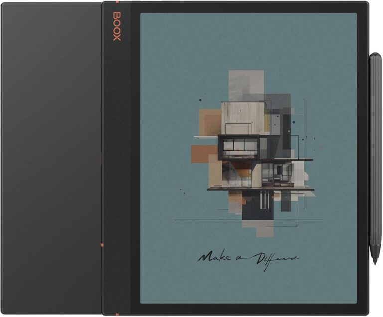
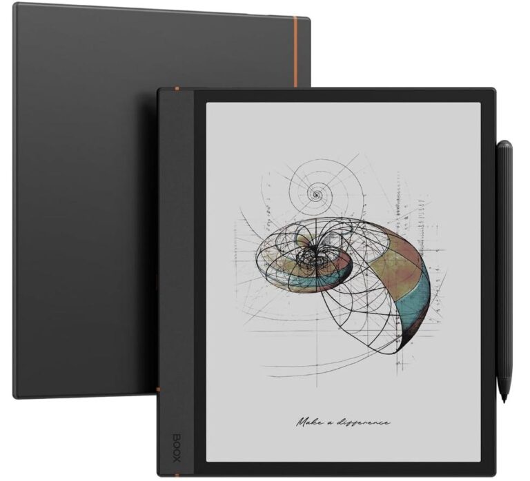
A Canvas for Your Creative Brilliance
Unleash your imagination with Note Air4 C. With its natural paper-like writing feel and robust note-taking tools, it’s truly an incredible canvas for your creative journey, from thought to creation.
-
<picture class=”active”>

</picture>Capture Inspiration
When It StrikesIgnite creativity from the moment of conception. With a wide selection of templates, brushes, layers, and AI-powered Smart Scribe tools, you can effortlessly transform a simple idea into an intricate sketch, capturing your initial thoughts without missing a beat.
-
<picture class=”active”>

</picture>Refine Your Design Work
with PrecisionTake your artwork from draft to perfection with advanced art tools for the finest details. Create and edit a shape to your liking with the new Shape³ tool, and use the Lasso tool to flexibly select and move elements within the notes.
-
<picture class=”active”>

</picture>Keep Your Notes
More OrganizedOrganize your work systematically with folders, tags, and the new Outline⁴ feature to arrange your notes into a clear structure. The Link tool connects all your thoughts, making your notes, documents, and online resources more accessible and navigable.

</picture>
Effortless Reading, Instant Efficiency
Enjoy comfortable viewing with muted colors that improve focus and reduce eye strain. With a suite of powerful tools in the NeoReader, you’ll get a personalized and productive reading session.
-
<picture>

</picture>Customize with Preset Appearance⁵
Improve readability with preset appearance for different materials. Whether for academic papers, technical documents, or leisure novels, you can choose an optimal view or customize one that best suits your needs.
-
<picture>

</picture>Highlight, Annotate & Mark Freely
Capture your insights and ideas with the freedom to highlight, annotate, and mark any document⁶ in NeoReader. Or jot down quick notes with the FreeMark tool while reading ebooks with other apps or browsing your favorite newspaper.
-
<picture>

</picture>Multi Tasks on One Screen
Boost your productivity with the split-screen function, which allows you to take notes while reading and open two apps at once. From juggling research and writing to comparing data across multiple documents, you can handle them fine.
-
<picture>

</picture>Read on and on, Light or Dark
Enjoy uninterrupted reading in any lighting conditions with adjustable front lights. Flexibly switch between a cold light for daytime and a warm light for cozy nights. You can also use the Dark Mode for a more focused and serene experience.
Sync, Share, and Connect

</picture>
<picture>

</picture>
<picture>

</picture>
-
Sync Work Seamlessly
Transfer files between your BOOX tablet, computer, and phone with the BOOXDrop, and sync all your notes and book annotations to Google Drive, Dropbox, OneDrive, or Onyx cloud* for access anytime, anywhere.
-
Share Ideas Live
Instantly present what you’re writing and sketching to a PC or TV with BOOXDrop Screen Mirroring. It helps visualize your ideas more clearly during brainstorming sessions, team meetings, or client presentations.
-
Connect with Ease
Easily connect with others through email, instant messaging apps, or real-time collaboration tools. Whether you’re sharing files or working online together on a project, Note Air4 C ensures an efficient workflow.
Intuitive Controls at Your Fingertips
-
<picture>

</picture>Simplify your interaction with a tablet-like user interface, the first-ever in the Note Series. Get a more personalized home screen with custom widgets to view the most important messages without launching an app. -
<picture>

</picture>Organize icons with a single tap and summon your frequently-used apps right from the Dock. The Smart Assistant page⁷ is your personal productivity hub, offering swift access to the essential tasks and tools you use most.
*Check and update your Note Air4 C to the latest firmware for an enhanced experience.
Classic Style, Timeless Elegance
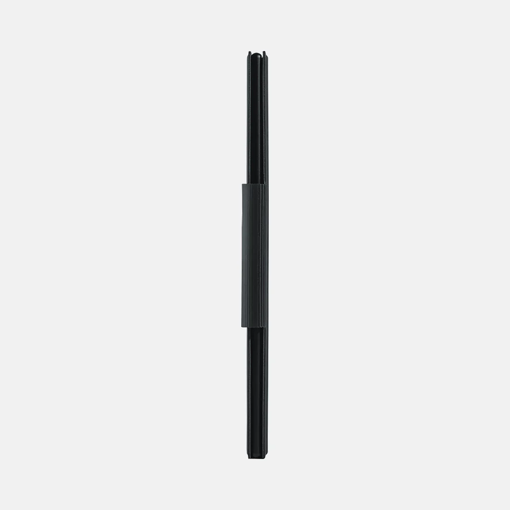
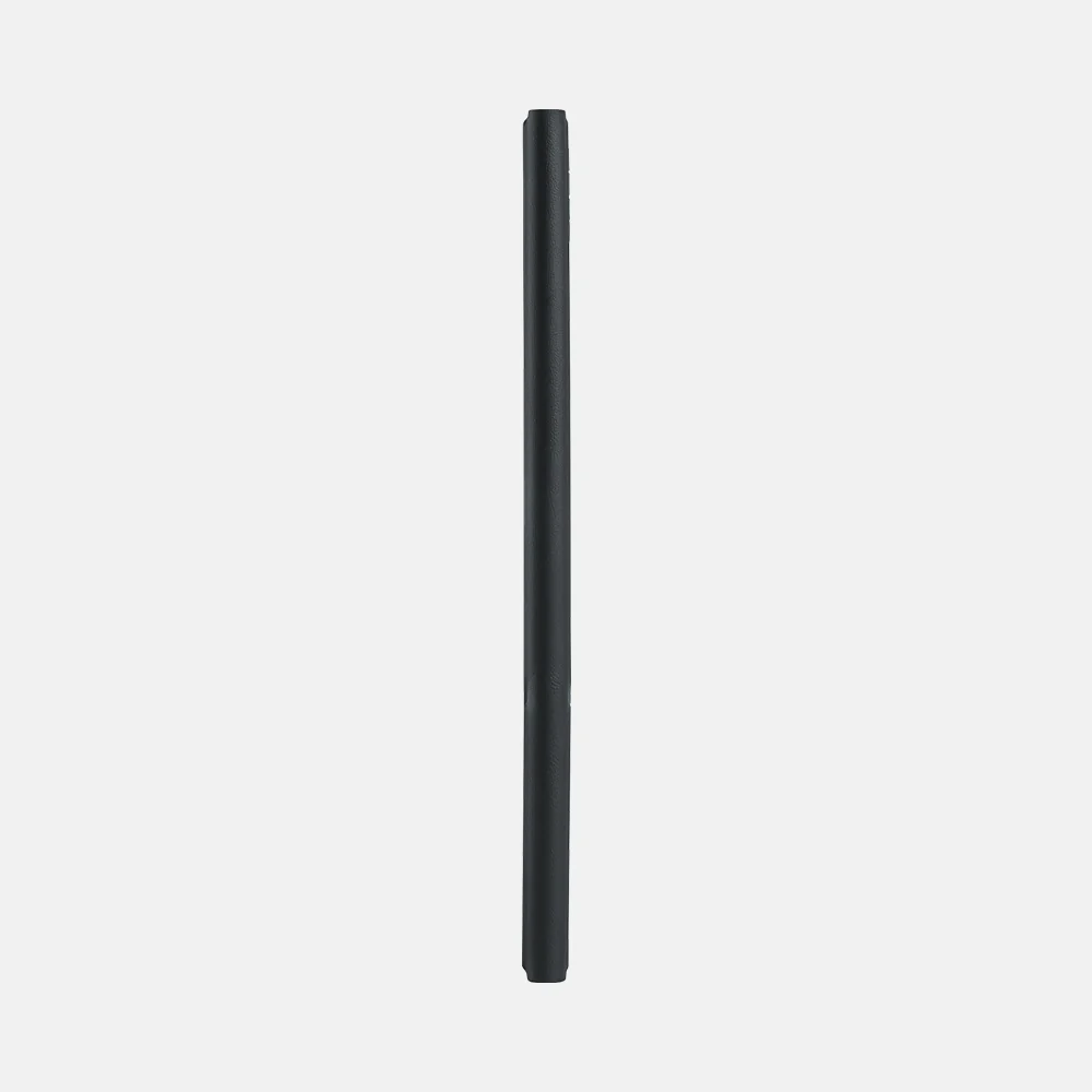
The Note Air4 C retains the classic linear design from the previous generation, elegantly traced by a signature notebook strip on its back. With an ergonomic wide bezel in a sleek 5.8 mm profile and a light 420 g weight, this tablet is always comfortable for your grip and ready to accompany you.

</picture>
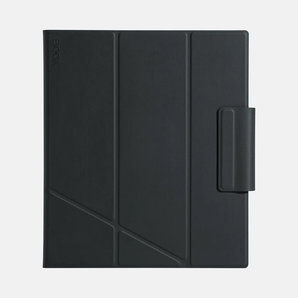
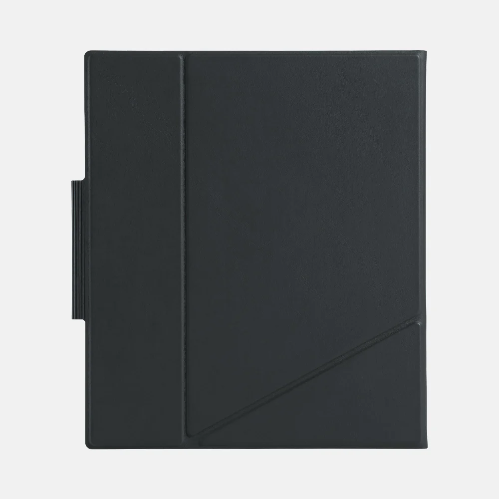
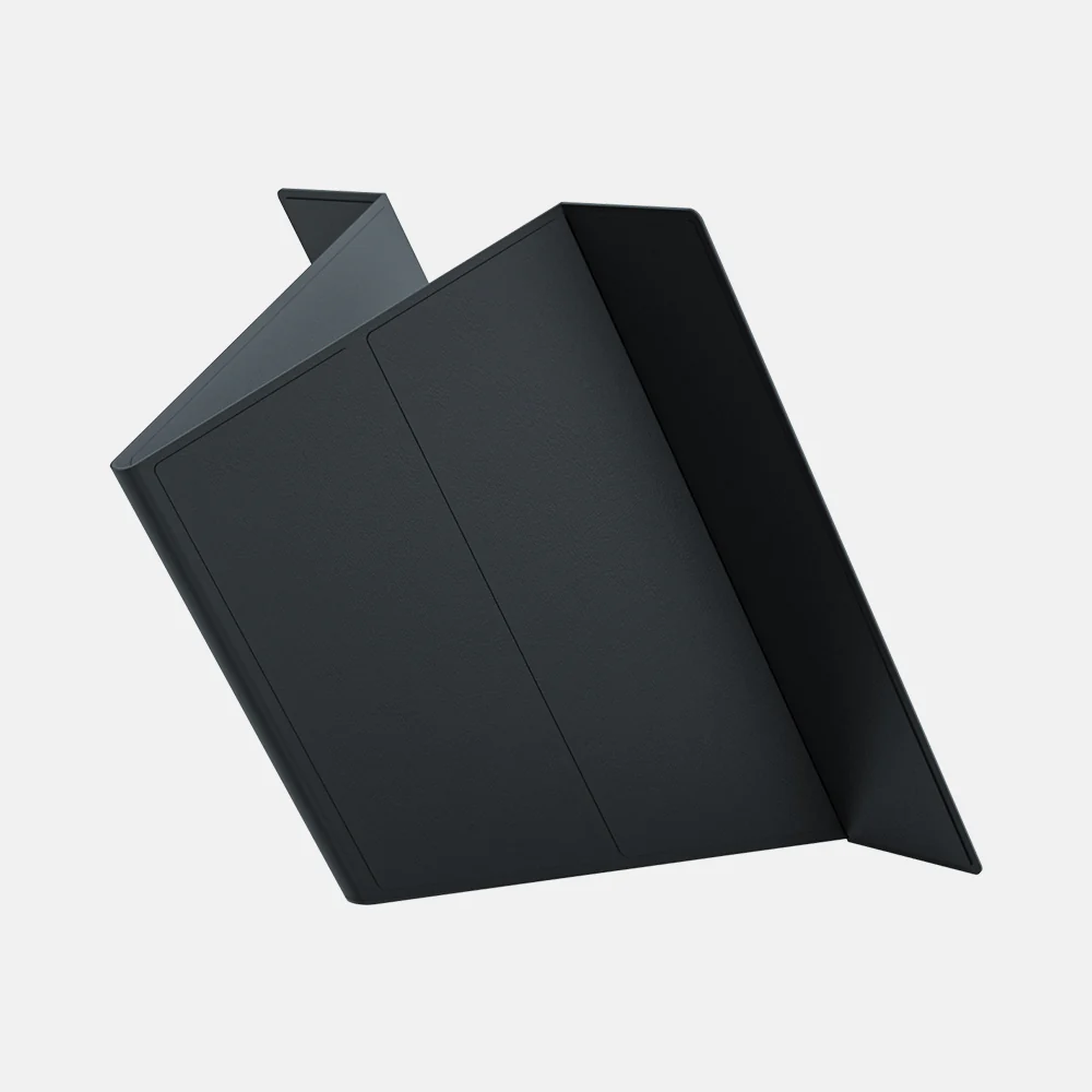
Stay Ready for Every Inspired Moment
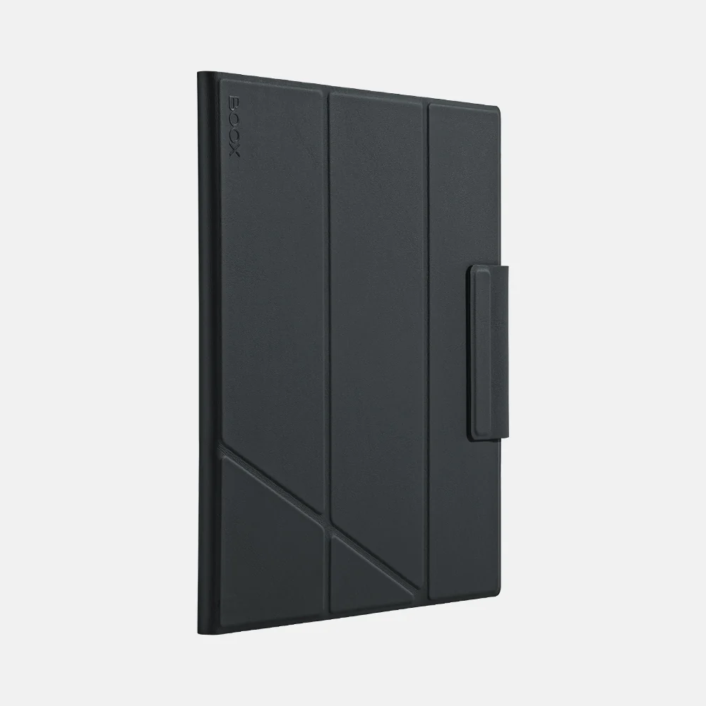
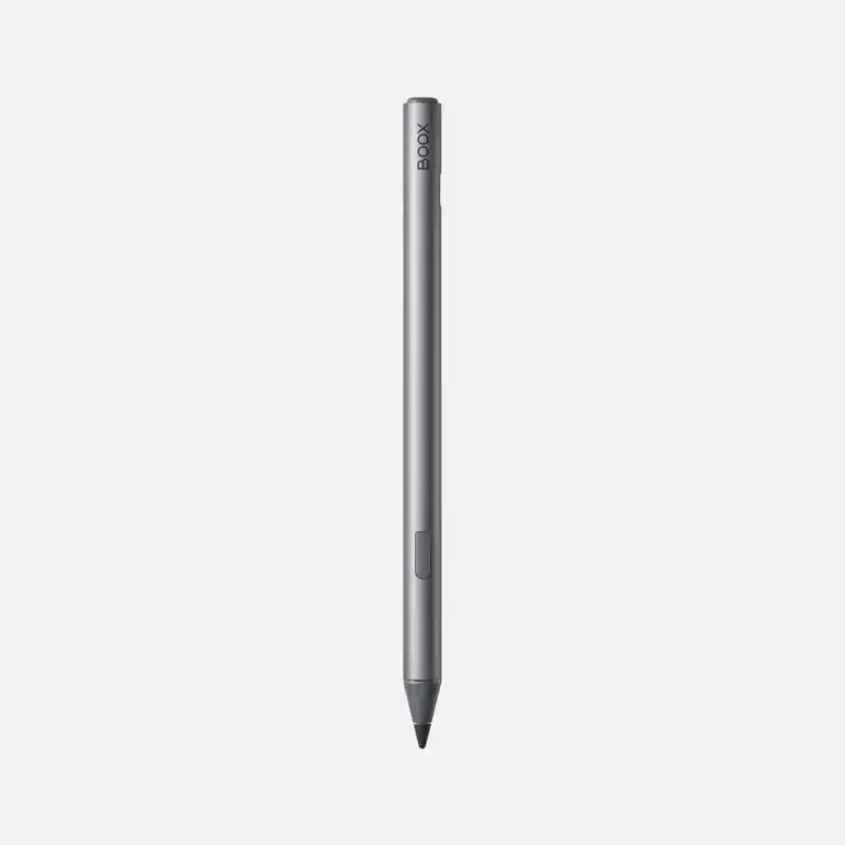
Let your thoughts flourish with the highly-responsive Pen Plus that enables smooth, accurate writing, and attach it magnetically to the side of the tablet for easy carrying. With the flexible three-stand magnetic case, you can streamline usage in different scenarios.

</picture>
<picture>

</picture>
Craft Your Next Masterpiece with the Pen Plus


Reviews
There are no reviews yet.